In the world of design, where sleek and polished visuals often dominate, distressed graphics stand out as a celebration of imperfection and history. They are more than mere aesthetic choices; they are a tribute to the passage of time, a nod to the beauty found in wear and tear, and a testament to the enduring appeal of the vintage.
Distressed graphics evoke a sense of nostalgia, authenticity, and charm. They transport us back to bygone eras, connecting us with memories and traditions that have shaped our cultural landscape. Whether it’s the faded lettering on an old sign, the crackled texture of a historical photograph, or the worn edges of a beloved book cover, distressed elements add character and depth to various design projects. These graphics are not just about looking old; they are about capturing a feeling, a moment, or a story. They speak to our collective longing for simplicity and genuineness in an increasingly digital and sanitized world. They remind us of the value of craftsmanship, the beauty of flaws, and the artistic potential that lies in the seemingly mundane.
But how does one create these vintage and worn-out effects that resonate with audiences? How do designers balance the old with the new, the imperfect with the polished, and the historical with the contemporary? This hands-on guide explores the techniques, applications, and the timeless appeal of distressed design elements.
We’ll delve into the various methods used to achieve distressed effects, from texture overlays to hand-drawn imperfections. We’ll explore the diverse applications of distressed graphics in branding, packaging, apparel design, and more. And we’ll uncover the psychological and emotional impact of distressed design, understanding why it continues to captivate and inspire.
Section 1: What Are Distressed Graphics?
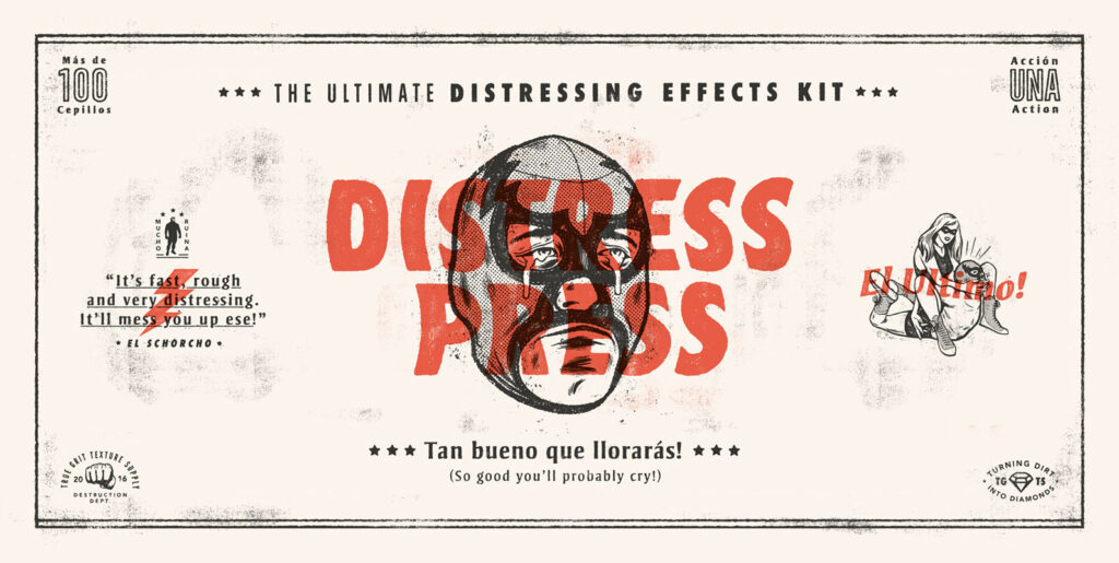
Distressed graphics are design elements that have been intentionally aged or worn to create a vintage or rustic appearance. These effects can include scratches, fading, cracks, and other imperfections that mimic the natural wear and tear of time. Distressed graphics can be applied to fonts, logos, illustrations, and more, offering a unique aesthetic that connects with the past.
Section 2: Techniques for Creating Distressed Graphics
2.1 Texture Overlay
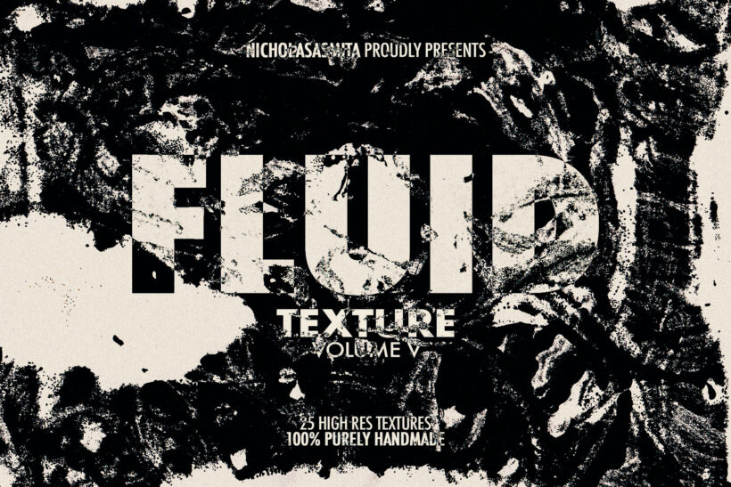
Texture overlay involves using textured images or brushes to overlay on the design, creating a worn-out effect. This technique can simulate the appearance of weathered surfaces, such as rusted metal or peeling paint. By carefully selecting and manipulating textures, designers can achieve a realistic and visually appealing distressed look. Texture overlay offers a versatile and accessible way to infuse designs with character and history.
2.2 Hand-Drawn Effects
Hand-drawn effects involve manually drawing scratches, marks, and imperfections to add a personal touch. This method allows for a high degree of customization and artistic expression, as designers can create unique patterns and textures that reflect their vision. Hand-drawn effects often convey a sense of craftsmanship and authenticity, resonating with audiences who appreciate the human touch in design. They can be particularly effective in projects that aim to evoke nostalgia or artisanal quality.
2.3 Digital Filters
Digital filters refer to applying digital effects in software like Photoshop to achieve a distressed look. This technique leverages the power of technology to mimic the appearance of aging, fading, or damage. Designers can choose from a wide array of preset filters or create custom effects to suit their specific needs. Digital filters offer a quick and efficient way to achieve distressed effects, providing control and consistency across different design elements.
2.4 Physical Distressing
Physical distressing involves creating physical wear on printed materials and then scanning them for a truly authentic effect. This method can include techniques such as sanding, crumpling, or staining the material to create tangible imperfections. The scanned result captures the intricate details and textures of the physical distressing, offering a level of realism that’s hard to replicate digitally. Physical distressing connects the digital design world with traditional artistry, bridging the gap between the old and the new.
Section 3: Applications of Distressed Graphics
Distressed graphics have found their place in various design fields:
3.1 Branding
Distressed graphics play a vital role in building authentic and nostalgic brand identities. By incorporating vintage elements and textures, brands can evoke a sense of heritage, tradition, and timelessness. This approach resonates with audiences who value authenticity and connects them to a brand’s history or core values. Distressed branding can be particularly effective for artisanal products, heritage brands, or those seeking to create a connection with the past.
3.2 Packaging
In the realm of packaging, distressed graphics enhance product presentation with a vintage appeal. Whether it’s a rustic food label or a retro-inspired perfume box, distressed elements add character and distinction. They can create a tactile experience, inviting customers to touch and explore the product. Distressed packaging often communicates craftsmanship, quality, and a sense of nostalgia, setting products apart on the shelves.
3.3 Apparel Design
Distressed graphics are a popular choice in apparel design, creating unique and eye-catching t-shirt and clothing designs. From faded logos to worn-out patterns, these effects add texture and visual interest to garments. They can convey a relaxed, casual vibe or pay homage to vintage fashion trends. Distressed apparel design appeals to a wide range of consumers, offering endless creative possibilities for designers and fashion brands.
3.4 Interior Decor
In interior decor, distressed graphics add character to spaces with wall art, murals, or decorative elements. They can transform a modern room into a cozy, vintage-inspired haven or add a touch of industrial chic to an office space. Distressed interior decor often tells a story, reflecting the personality and tastes of the inhabitants. It creates a visual dialogue between the old and the new, blending history with contemporary design sensibilities.
Section 4: The Nostalgic Appeal of Distressed Design
Distressed graphics tap into a longing for the past, evoking memories and emotions that transcend mere visual aesthetics. This connection to nostalgia is multifaceted and rich, offering designers a powerful tool for storytelling and emotional engagement.
4.1 Warmth and Familiarity
Distressed graphics often create a sense of warmth and familiarity. They remind us of well-loved objects, cherished memories, and times gone by. Whether it’s the worn pages of a favorite book or the faded photographs of our grandparents, distressed elements resonate with our shared human experience. They invite us into a comforting space, where we can connect with our roots and reflect on our personal histories.
4.2 Authenticity and Character
The imperfections and textures found in distressed graphics convey authenticity and character. They reject the sterile perfection of digital design, embracing flaws as a testament to craftsmanship and individuality. This authenticity speaks to viewers on a profound level, appealing to a desire for genuine connections and meaningful experiences. It celebrates the beauty in imperfection and the value of the handmade.
4.3 Storytelling and Emotional Connection
Distressed graphics are a powerful tool for storytelling and emotional connection. They can transport viewers to different times and places, weaving narratives that captivate and inspire. Whether it’s a brand telling its origin story or an artist sharing a personal journey, distressed elements add depth and dimension to the narrative. They create a visual language that communicates not just information but feelings, emotions, and shared values.
4.4 Cultural Resonance
The nostalgic appeal of distressed graphics also has cultural resonance. It reflects societal trends and collective memories, connecting with broader themes of heritage, tradition, and identity. Distressed design can be a celebration of cultural history, a tribute to artistic movements, or a commentary on the passage of time. It engages with the cultural zeitgeist, offering insights and reflections that go beyond individual experiences.
Section 5: Tips and Best Practices
- Understand the Context: Ensure that distressed effects align with the project’s theme and audience.
- Balance the Distressing: Too much distressing can overpower the design; find the right balance.
- Experiment and Iterate: Try different techniques and approaches to achieve the desired effect.
- Consider Legal Aspects: If using vintage imagery, ensure proper licensing and copyright compliance.
Distressed graphics offer a window into the past, allowing designers to craft visuals that are rich in character and authenticity. Whether you’re looking to add a touch of vintage charm to a modern brand or create a truly timeless piece of art, the techniques and insights shared in this guide can help you embrace the beauty of distressed design. Let the worn-out textures and faded colors inspire your creativity and connect with audiences in a meaningful way.


